Google start rolling out a new Settings menu to quickly optimize Gmail Layout. Let’s find out more about the feature.
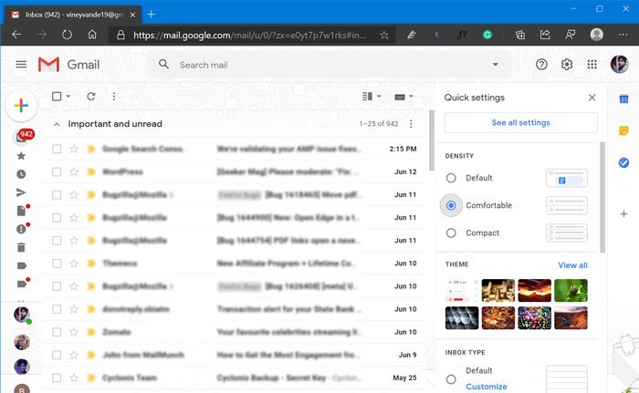
So far, users have to click on the Settings (gear) icon available on the right side to change Theme, email density, and Configure inbox. Starting today, the Google announced a new Quick Setting menu using which users can quickly optimize Gmail design.
According to Google, the purpose of adding “Quick Settings menu” is to make it easier for the users to make changes in the Gmail design. The Settings (gear) icon is now move to top and visible between Google app launcher and Support icon.
Gmail’s new Setting menu is available for people all across the globe. If you’re lucky one to have it, then here’s how you can use the feature:

After you log in to your Gmail account, clicking the Settings (gear) icon available at top-right side will show you Quick Setting menu, accompanied by link to called “See all Settings“
The new Setting menu has four different section which includes:
- Density – You can optimize density of text and information displayed in inbox
- Theme – Find and apply Gmail themes, you can also click on “View all” to get full list of themes.
- Inbox Type – Find different inbox types, select the one to organize and prioritize emails.
- Reading pane – Reading pane will help you in seeing email content quickly, select the one which you find perfect.
Apart from this, there’s a section called “Email Threading” that has an option called Conversation view, which is enabled out of the box. You can check this gif (Gmail New Setting menu in action)
Recently, Google introduced a Google start rolling out this feature today so it is expected that you will start seeing the new setting menu in 15 days.
What are your thoughts about Gmail’s Quick Setting menu? Does the feature arrive for you? Did you like it? Let us know your opinion in the comments.
Thanks, Techdows for the tip!


