Microsoft is testing a new feature using which you can clean up unwanted icons and buttons from the Toolbar and Title bar in the Edge browser.
Microsoft recently added lots of features in the Edge browser and if you select to show icons for those features in the toolbar, then it takes up lots of space and lessens the space for the address bar.
It seems like, the new experimental feature is aimed to fix the crowded toolbar with unrequited icons and offer users a clean title bar and toolbar.
Enable & Use Show Basic Toolbar in Edge to Cleanup Toolbar & Titlebar
Right now, the new clean-up title bar and toolbar feature is available in the latest Edge canary and disabled out of the box. In case, you want to give it a try, then here’s how you can enable and use it:
In the Edge browser address bar, you need to visit this flag address: edge://flags/#edge-basic-toolbar-titlebar and hit enter.
This will highlight Microsoft Edge basic title bar & toolbar feature. Using the drop-down next to it, change the settings from Default to Enabled.

Click on the Restart button to apply the changes.
At this point, you have successfully enabled the Toolbar and Title Bar clean-up toot in Microsoft Edge. Let’s learn how to use it:
Click on the three dots (…) icon and select Settings.
Switch to the Appearance tab on the left and then on the right side, scroll down to the option “Show basic toolbar“. Enable it by toggling ON the switch next to it.
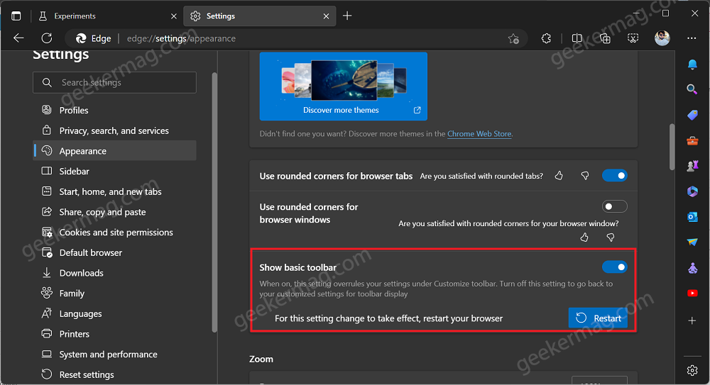
To apply the changes, click on the Restart button.
Instantly, the same settings will override your current settings under Customize toolbar section. And show limited icons on the toolbar.
You can check following screenshot before and after applying the feature:
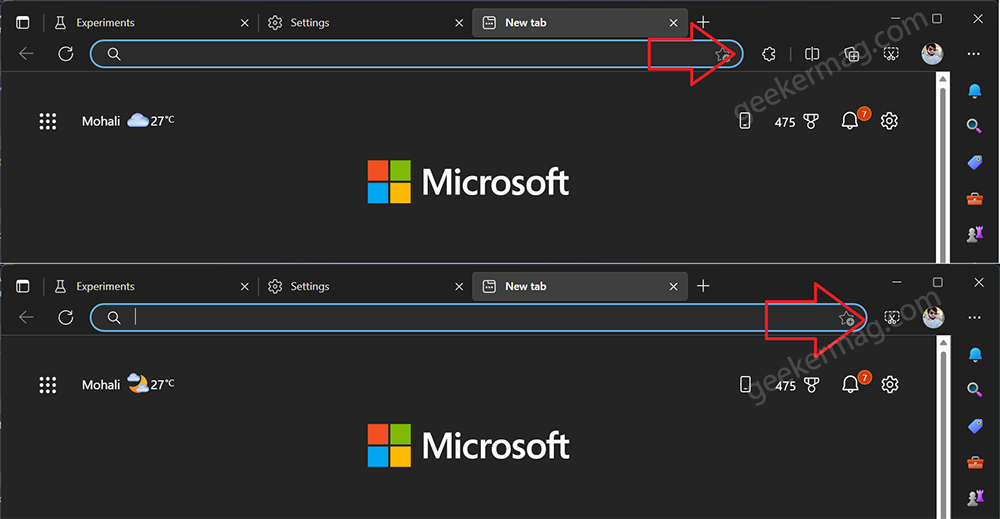
You can clearly see in the screenshot that, before four buttons appear on the toolbar, and after applying the setting, it only shows the important Edge web capture icon.
What is your opinion about the new feature that Microsoft added to clean up Toolbar and Title bar in the Edge? Let me know in the comments.



1 Comment
Did you end up continuing to use the “basic title bar & tool bar” or switch it back?
Debating on switching, but I’m playing around with a lot of flags right now and don’t want to change too much at once 🙂
Thanks for the article!